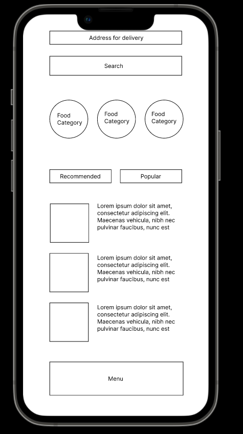
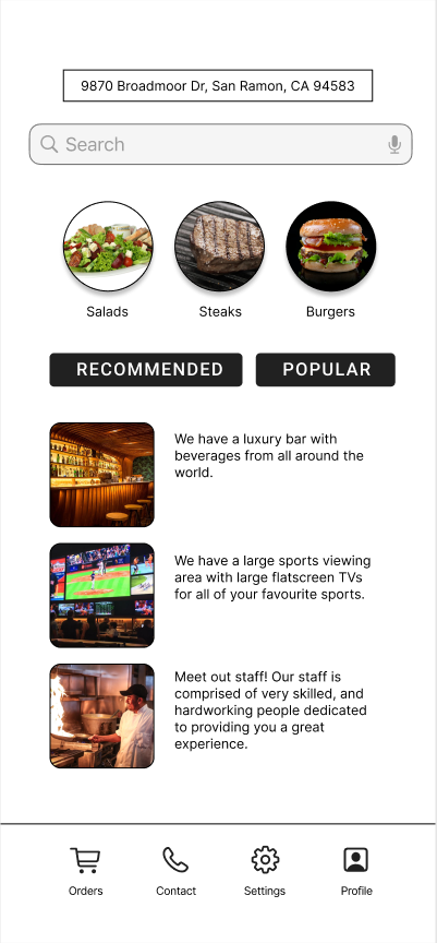
 1) How was the process of adding graphics?
The process of adding the graphics went very smoothly and all images behaved the way I wanted them to.. 2) What was the easiest part of the activity today? Finding images for my design. 3) What was the most difficult part? Learning how to have the figma shapes behave the way I want them to. 4) Why did you chose to use the menu items you used? I chose to use these menu items because they seem to be eye catching items. Part 1:
1) After watching this video I feel as if I have gained a new perspective as to how people with disabilities navigate our world/society. I had really never thought about how difficult it would be to carry out tasks that are trivial for most if you have a disability such as Sinead. 2) As a designer more work can be put towards thinking about all possible use cases for the thing that is being designed. Instead of just thinking how an average person might use it, all extremes of people should be accounted for in order to be accessible to all. 3) When I think about how it is to experience life the way she does that is called empathy. Part 2: 1) Web Design, Video Game Development, Interior Design 2) Don Norman 3) He studied electrical engineering and mathematical psychology at MIT. 4) The Design of Everyday Things 5) Norman puts forward the idea that the two most important components of good design are discoverability and understanding. 6) Cues that allow people to understand what something does without any explicit instruction. 7) Signifiers are visible signs or sounds (signals) that communicate meaning to the user. 8) Seven stages of product design 9) A 'dumbing down' of user behavior. 10) Steve Jobs Part 3: 1) Two apps that I think have great user experience are the Spotify app and Venmo. 1) What is one thing that you learned from Chip Kidd?
I learned that when designing, it is important to use a combination of clarity and mystery based on your goals for what reaction you want viewers to have. Clarity is important to successfully get the message across, while mystery is important to hook the viewer in. 2) Would you like to do the same type of design as Chip, why or why not? Yes, I would like to do the same type of design as Chip because I believe that it is very clever and it successfully uses both clarity and mystery to effectively give the viewer enough information while still hooking them in. 1. It was easy/hard to decipher the colors, and why?
It was fairly difficult to decipher the colors because a lot of the colors were very similar and I am colorblind so colors that are very similar look pretty much the same to me. 2. How does the Pantone system improve design and printing? The Pantone system improves design and printing by creating a standard protocol to define different colors that is understandable worldwide. It basically is a universal color language. 3. When would be a good time to use Pantone colors in this class? It would be a good time to use Pantone colors when designing logos or branding because when designing branding images it is critical to make sure all colors are identical among all branding. 1) What is the principle you are animating?
In my animation I am using arcs with the rose and arm of SpongeBob by bending them as SpongeBob hovers up and down. I am also using exaggeration by making SpongeBob's heart eyes dramatically increase in size when he reaches the top of his hover to simulate a heart beat. 2) Was it easy or difficult to use puppet warp & why? For me it was fairly difficult to use the puppet warp tool because many times when warping part of the arm it would create undesirable effects and generally seemed a little bit finicky. This however is similar to how the pen tool felt to me initially but now after some practice it feels easier to use which is most likely the case with the puppet warp tool as well. 3) What do you like about your animation? I personally like how the rose moves in the air when SpongeBob hovers and I also like the increase in size of the heart eyes as it truly gives off the impression of a heart beat. 4) What would you change about your animation? I could possibly try to continue working with the puppet warp tool to make the movements look a little smoother. It was easy to use my obstruction of cartoons because there are endless cartoons which I could take inspiration from allowing me to successfully pull off a "SpongeBob" theme by using similar colors which are used in the show. The most difficult part was to make my own interpretation of SpongeBob as an emoji with all of the required expressions whilst still having the emoji actually look like SpongeBob. Overall I could have done better by playing around a little more with the proportions of the eyes, mouth and eyebrows to more closely match that of the actual SpongeBob.
|