 Does your image look like the word it represents, if so, how?
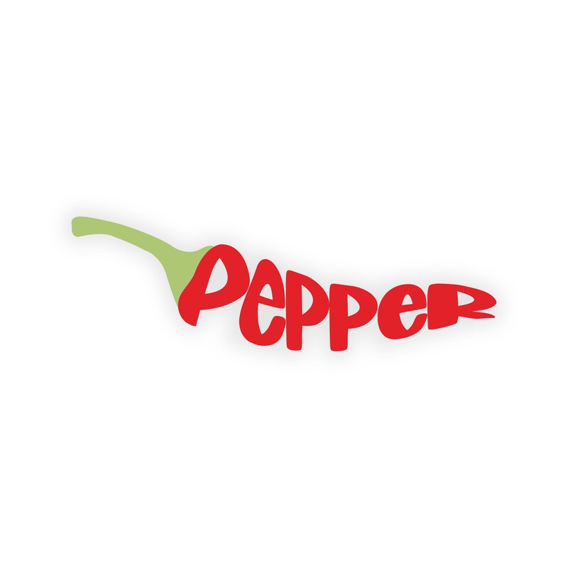
Yes, my pepper text looks like an actual chili pepper. The characters follow the shape of a standard chili pepper and the first P in the word has the chili pepper stem growing out from the side of it to clearly convey that the text is supposed to resemble an actual pepper. What is your favorite part of your image/word? My favorite part of my image is the stem attached to the first P in the word pepper. Personally, I feel as if it's nicely attached to make it look pretty natural. Did you start with a base typeface & what was it? Yes, I initially started with the "Little Comet" typeface. What would you have done differently? One thing that I might have changed is adding a shadow under the pepper text to make it look like the pepper is an actual object instead of just text. List 2 illustrator tools that you used to create this work. I used the pen tool, the shape builder tool, the envelope distort tool, and the pathfinder. List a principle of design you used in this work. I used unity when deciding to uniformly color all of the characters with the same shade of red in order to give off a minimalistic look. I also used color to convey that the image represents a pepper (the green stem and the red body).
0 Comments
|